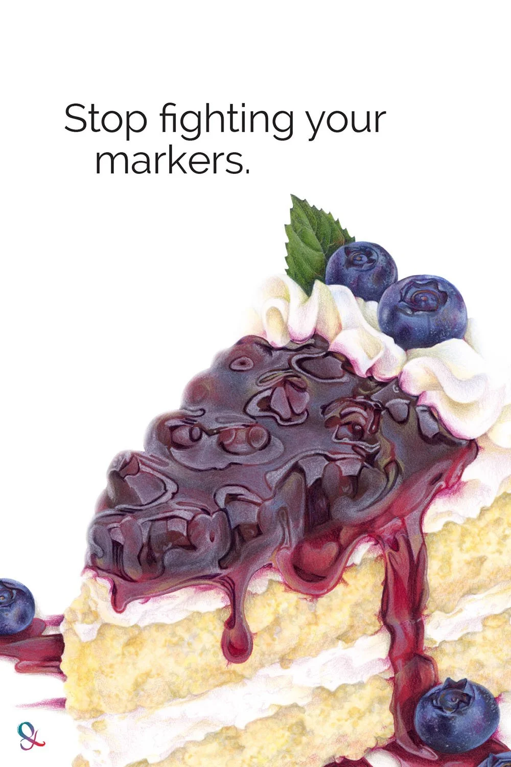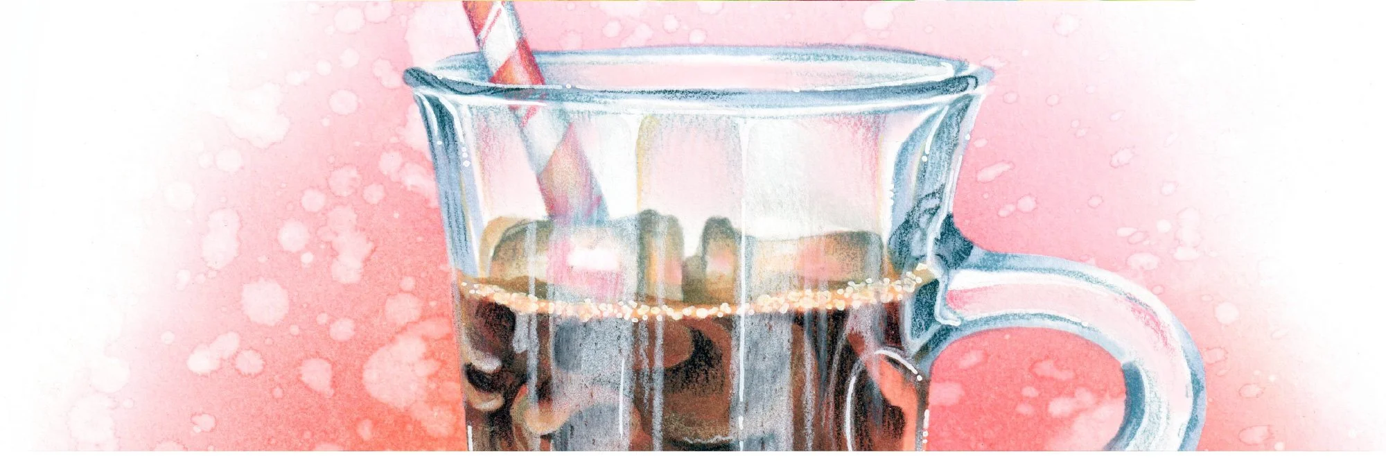

Alcohol markers are famous for bright, vivid color.
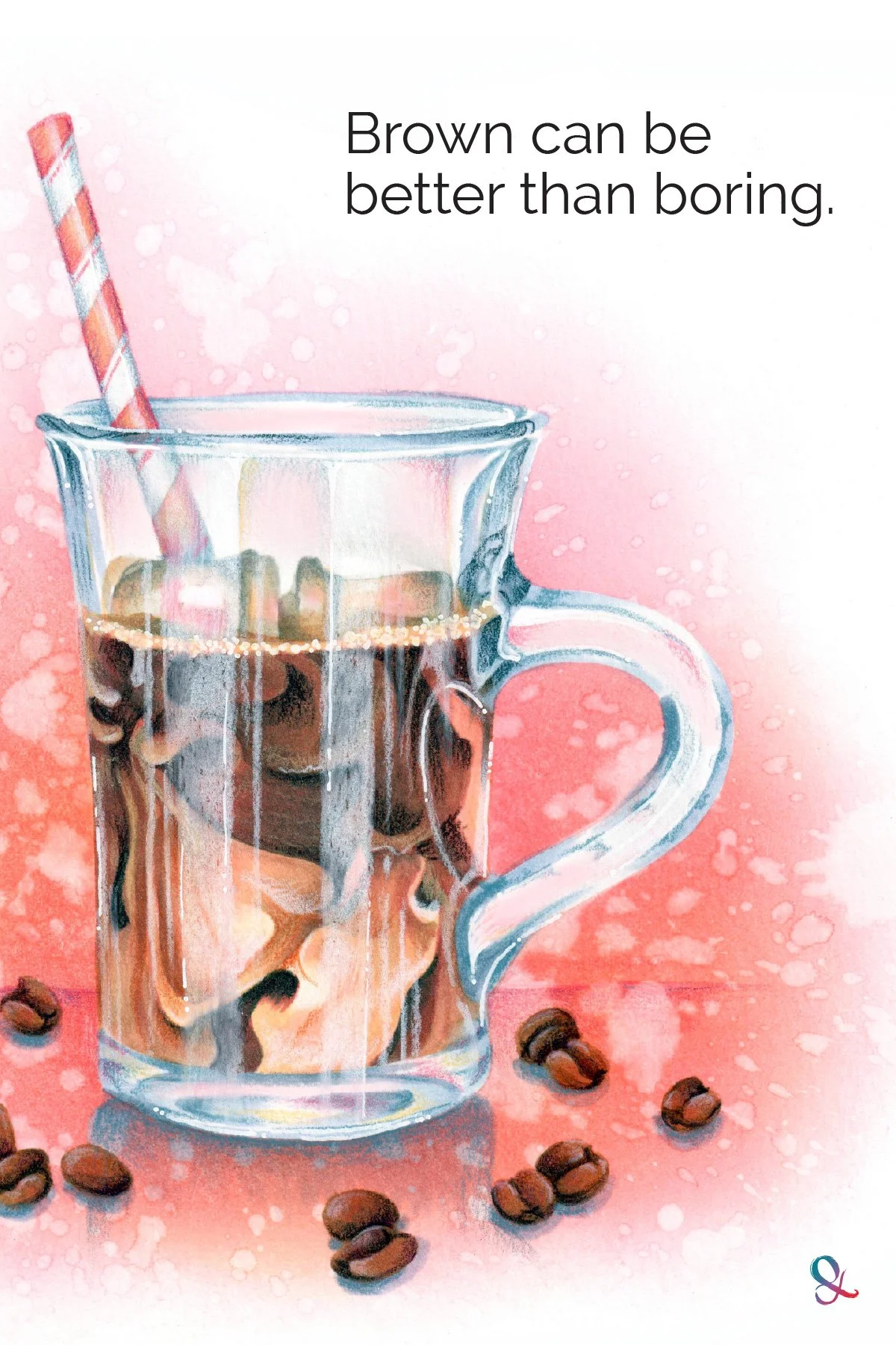
So why do so many marker projects end up looking dull?
We often use markers in ways that cancel their natural advantage.
We choose a light, medium, and dark marker from the same family…
Brown, brown, and more brown.
Then we keep layering until every transition is silky smooth.
The blend improves.
But the color gets tired.
Vibrant ink does not guarantee vibrant coloring. Your marker choices and layering habits can mute the color long before the project is finished.

Smooth Is Not the Same as Vibrant
A light-medium-dark blending combination is predictable because all three markers are essentially the same color.
This makes them easy to blend, but it also creates a very narrow range of color.
Then add several extra passes to smooth and blend every visible transition?
Your colors begin to average out into one bland, middle of the road, medium color.
Some colorists already worry about over-blending because it reduces contrast, and contrast helps create depth and dimension.
But loss of contrast isn’t the only danger.
Lack of interest is.
Your coloring is the most interesting when the colors you choose include variety and spice.
This is especially obvious with brown.
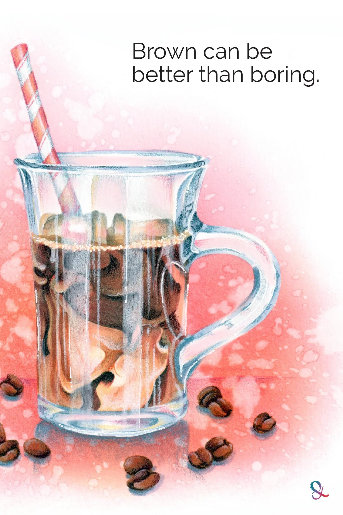
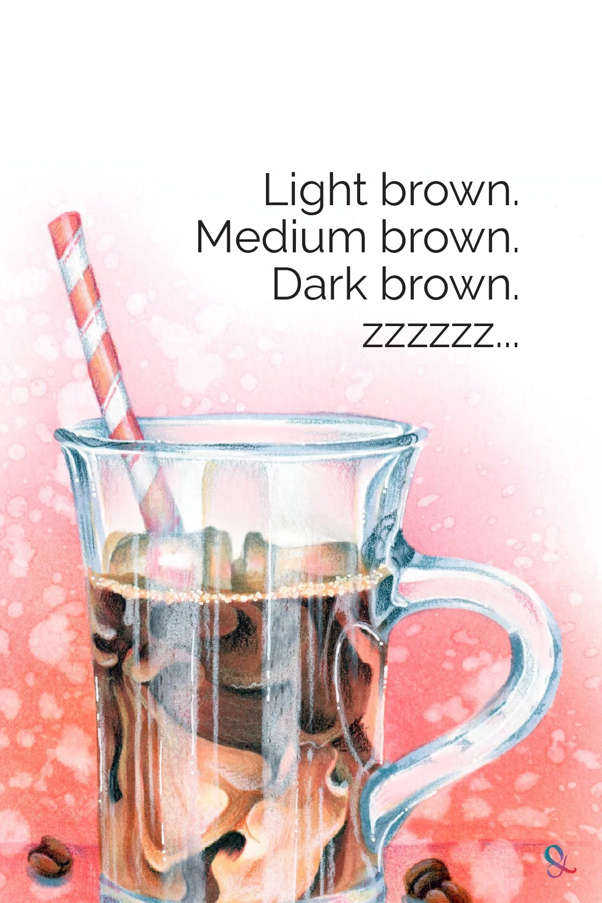
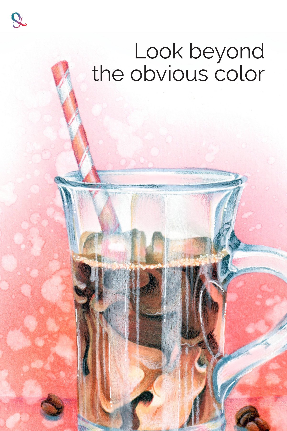
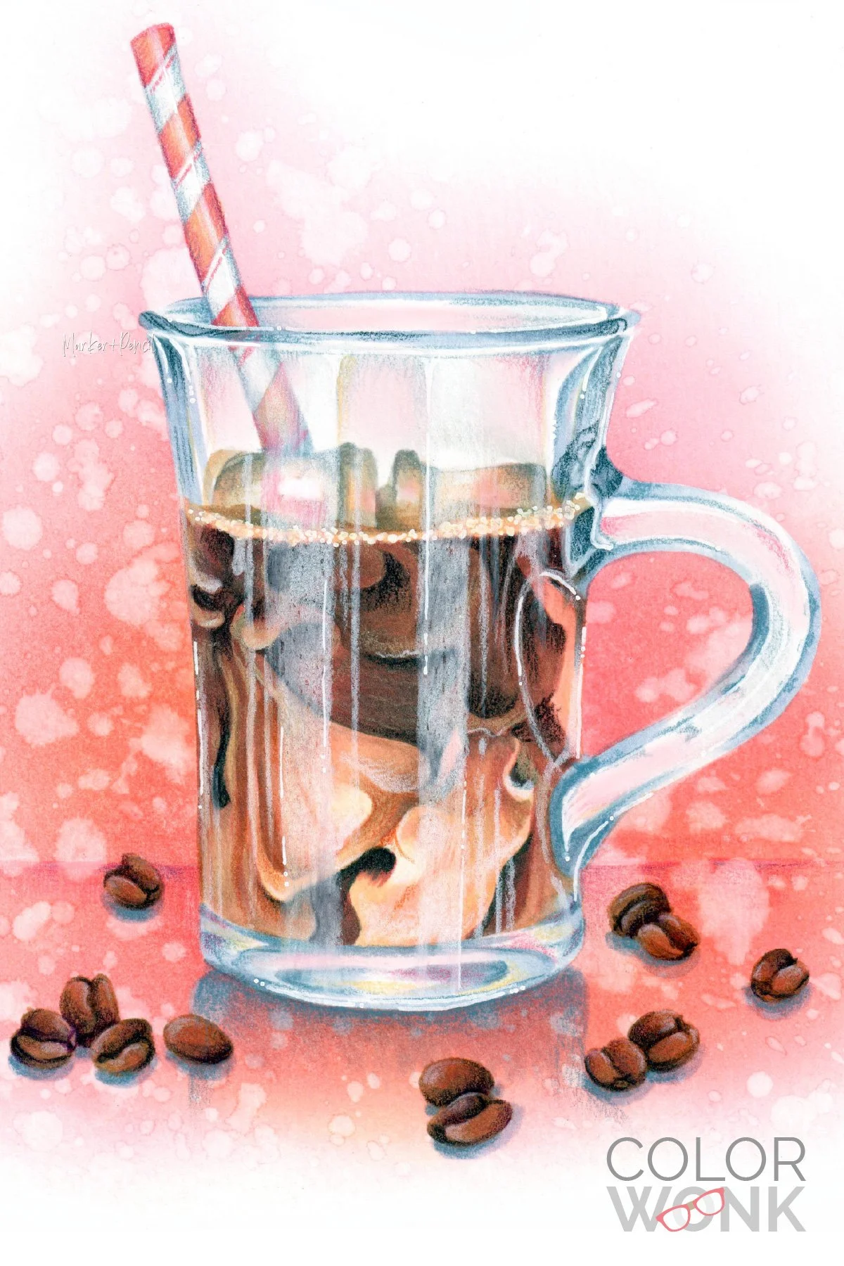
Light brown, medium brown, and dark brown will produce a brown object. But the combination often lacks the color energy that makes coffee, wood, fur, leather, or chocolate look alive.
Give the Color Something to React Against
The answer is not always a brighter brown.
Do they even make fluorescent browns?
Brown often needs another color nearby or layered into it:
yellow to add warmth and light
violet to deepen the shadow without adding more brown
pink to echo reflected color from the surroundings
These colors do not stop the coffee from looking brown.
They give the brown something different to react against.
Sometimes that difference comes from a neighboring color. It can also come from a complementary color placed nearby, where the two colors appear to vibrate against each other.
The greater the color variance, the more visual energy you create.
That’s a lot more energy than a brown-brown-brown combination can generate by itself.
And while we’re talking about brown here, the same principle applies to any color.
Blue-blue-blue and green-green-green can be equally low-energy combinations.
Look for Vibe Colors
Before reaching for a standard blending trio, ask:
What other colors are present in this brown?
I know that sounds like a strange question but it’s the kind of question artists are constantly asking.
Some colors simply feel as though they contain other colors. A blue object may feel slightly greenish in places. A green leaf may carry hints of purple.
Or, in this case, a brown may contain peachy-pink.
I call these “vibe” colors.
Vibes are hard to spot at first because they whisper. But if you look closely, vibes are everywhere and they’re an artist’s secret weapon.
If you can’t see the vibes yet, don’t give up. They have a habit of sneaking up on you when you least expect it. Then once you see them, you can’t un-see them.
Until then, stop asking:
What color is this coffee?
And stop worrying about which three cap numbers will blend best together.
Instead, ask what color would make the brown feel warmer, cooler, brighter, deeper, or more connected to its surroundings.
Add a little something extra to your brown.
That little somethin’-somethin’ is what adds interest and vibrancy.
Want to Sharpen Your Eye for Color?
Color Wonk is where we practice how artists look at color.
Wonk projects are not just about finishing a pretty picture or matching the class sample as closely as possible.
We talk about form, value, detail, and why the creative color choice is not always the most obvious one.
The goal is to help you understand what your project needs and make stronger decisions with less guesswork.
You still learn marker and colored pencil techniques.
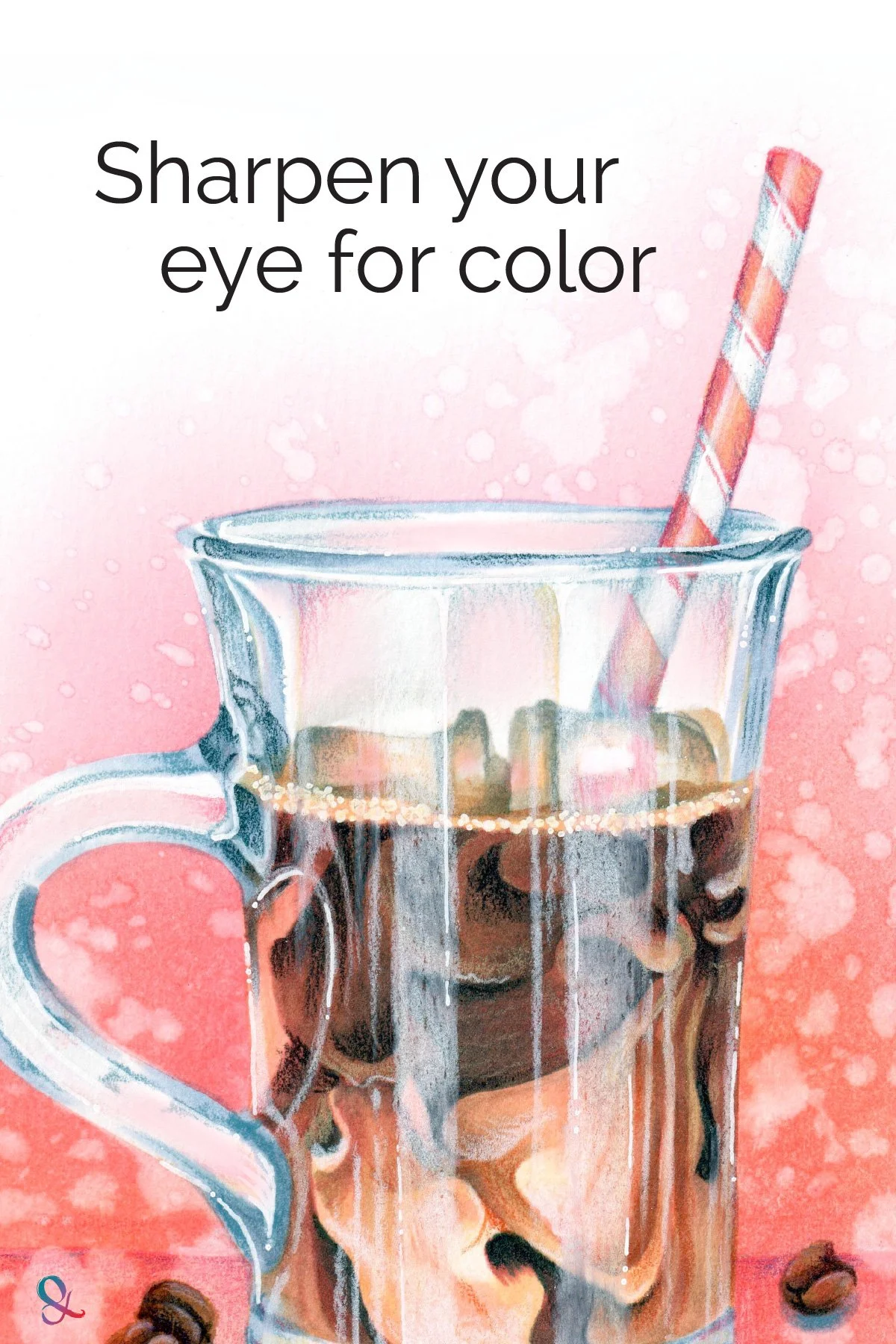
But the larger skill is learning to see color more clearly.
That’s what we work on inside Color Wonk.
Ready to Go Deeper?
Stop chasing recipes and start thinking like an artist
If this article sparked a new way of seeing, here are a few places to continue exploring:
Learn Artistic Realism
Guided Workshops
Build Basic Skills
RELATED ARTICLES: