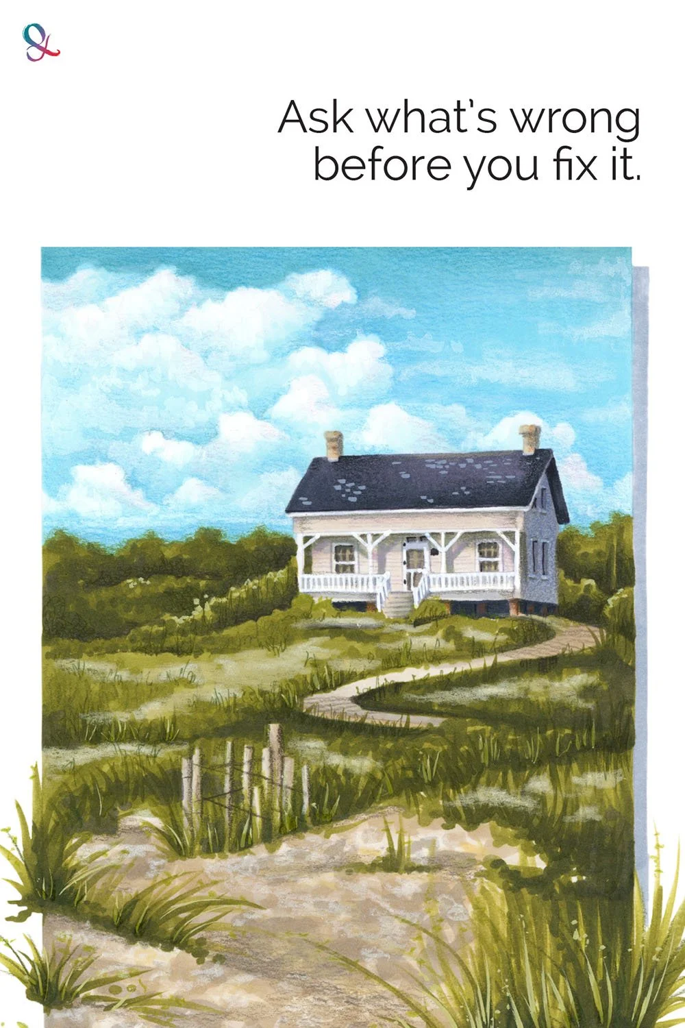
Different Is Not Wrong

Have you ever compared your project to the instructor’s sample and immediately felt disappointed?
Not because your coloring is bad.
Because it doesn’t match.
Your sky is darker. Your clouds are smaller. Your shadows are bolder…
Every difference feels like something went wrong.
But different is not automatically wrong.
To be fair, different is not automatically right, either.
That is where many colorists get stuck.
You’re stuck on the fact that you didn’t create an exact copy.
Sometimes different is a problem. Sometimes it’s a harmless variation. And sometimes it’s the best thing happening on the page.
This is why learning to clearly see your own coloring matters as much as learning which marker to use or where to put the pencil.
A correction only helps when you understand what actually needs correcting.
And sometimes what needs correcting is not the artwork.
It’s the way you’re judging it.
Comparison helps at the beginning, but comparison becomes a problem when every mismatch is treated as a mistake.
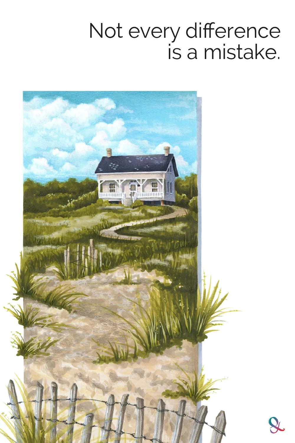
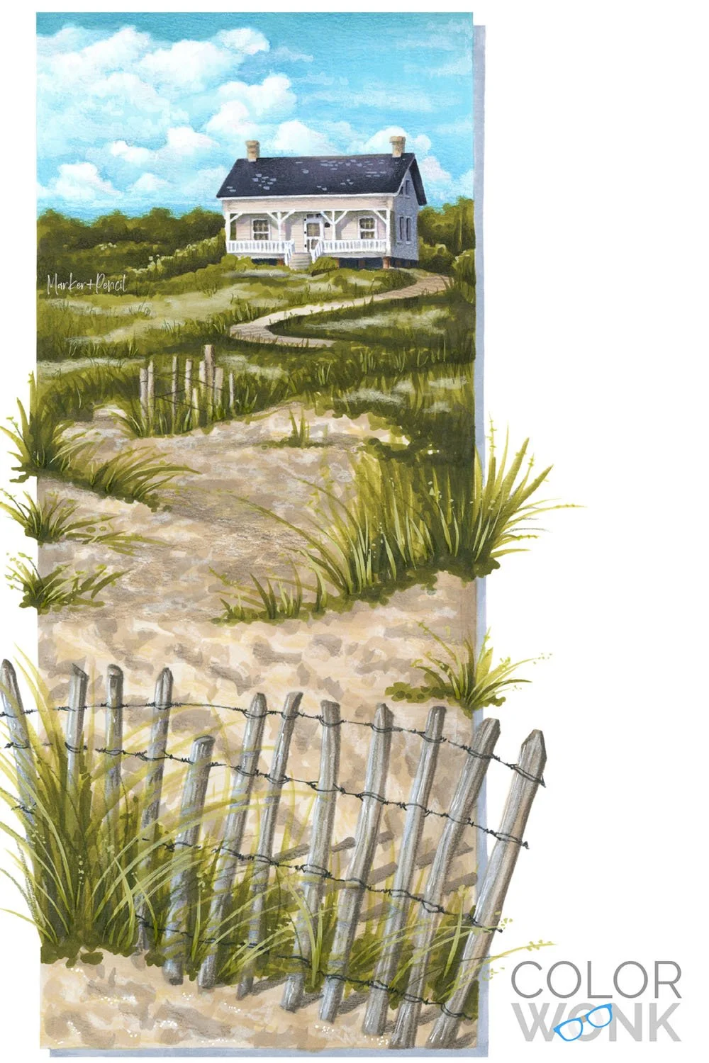
A class sample is one artist’s solution to the same visual problem you’re trying to solve.
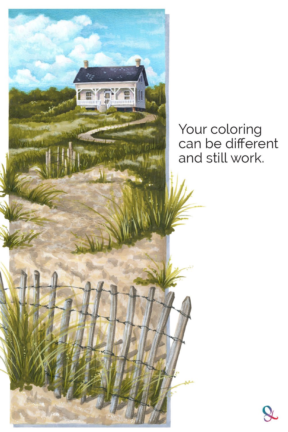
If your version is warmer, softer, or simply different, and the artwork still works, the difference may not be the problem.
Different is not a diagnosis. It’s only a clue.
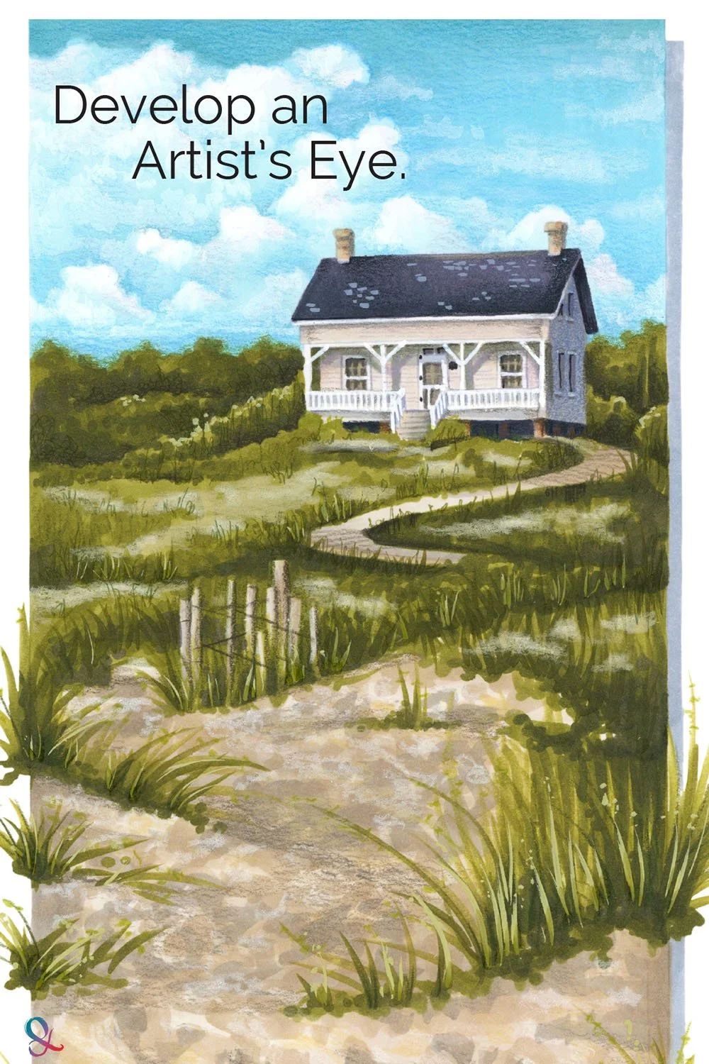
Putting the Reference Away
Artists are often taught to work from the reference intensely at first. In the early stages, accuracy matters.
But after a certain point, artists put the reference away.
Literally.
The phrase is common in studios because it marks an important shift. The artwork has now become its own thing.
From that moment on, the job is not to obey the reference in every tiny detail.
Now we respond to what’s actually happening on the paper.
This may mean deepening a shadow beyond the value in the reference, softening edges to create extra distance, or adding a pop of bright color to draw the eye back to the focal point
This is not permission to ignore accuracy from the beginning.
It’s recognition that eventually, the artwork gets a vote.
At some point, the question stops being “Does it match?” and becomes “What does the artwork need now?”
Many colorists never make that shift.
Which is why coloring can stay stuck in student-project mode instead of becoming original artwork.
The story is not the problem
When students make a mistake, they tell me exactly what happened:
They picked up the wrong color. The marker blobbed. The paper had a rough spot and it was 9:12pm on a Sunday night and they didn’t want to start over…
That story matters.
But that’s not the same as a visual problem.
“I used too much purple” is what happened.
“The shadow is too bright” is something we can fix.
“I pressed too hard” is what happened.
“The flower looks too heavy” is something we can fix.
The problem with mistakes is that you can’t stand there explaining what happened to every viewer.
This is why feedback matters.
A good outside eye is not emotionally tangled in the history of your coloring.
Someone else may notice that the area you hate is actually fine, while the real issue is the weird outline around every shape.
They may also notice something more important: the mistake is actually charming and lovely.
That’s not encouragement fluff.
It’s visual information.
Once you can name the real problem, the solution becomes logical and specific.
And sometimes the solution is to leave a beautiful mistake alone.
Better Coloring Begins With Better Questions
If your only question is “Does mine match?” then every difference feels suspicious.
But if you ask better questions, mistakes are easier to diagnose and resolve.
Does the shadow support the light source?
Can we see the form under the teture?
Is this part actually wrong, or does it simply differ from the sample?
These questions build the kind of artistic judgment no recorded coloring demo can give you.
They also make coloring less fragile.
You are no longer dependent on copying every step exactly.
You’re learning to see what’s happening, decide what matters, and respond with intention.
That’s where real improvement begins.
Not with a perfect match.
With a clearer eye.
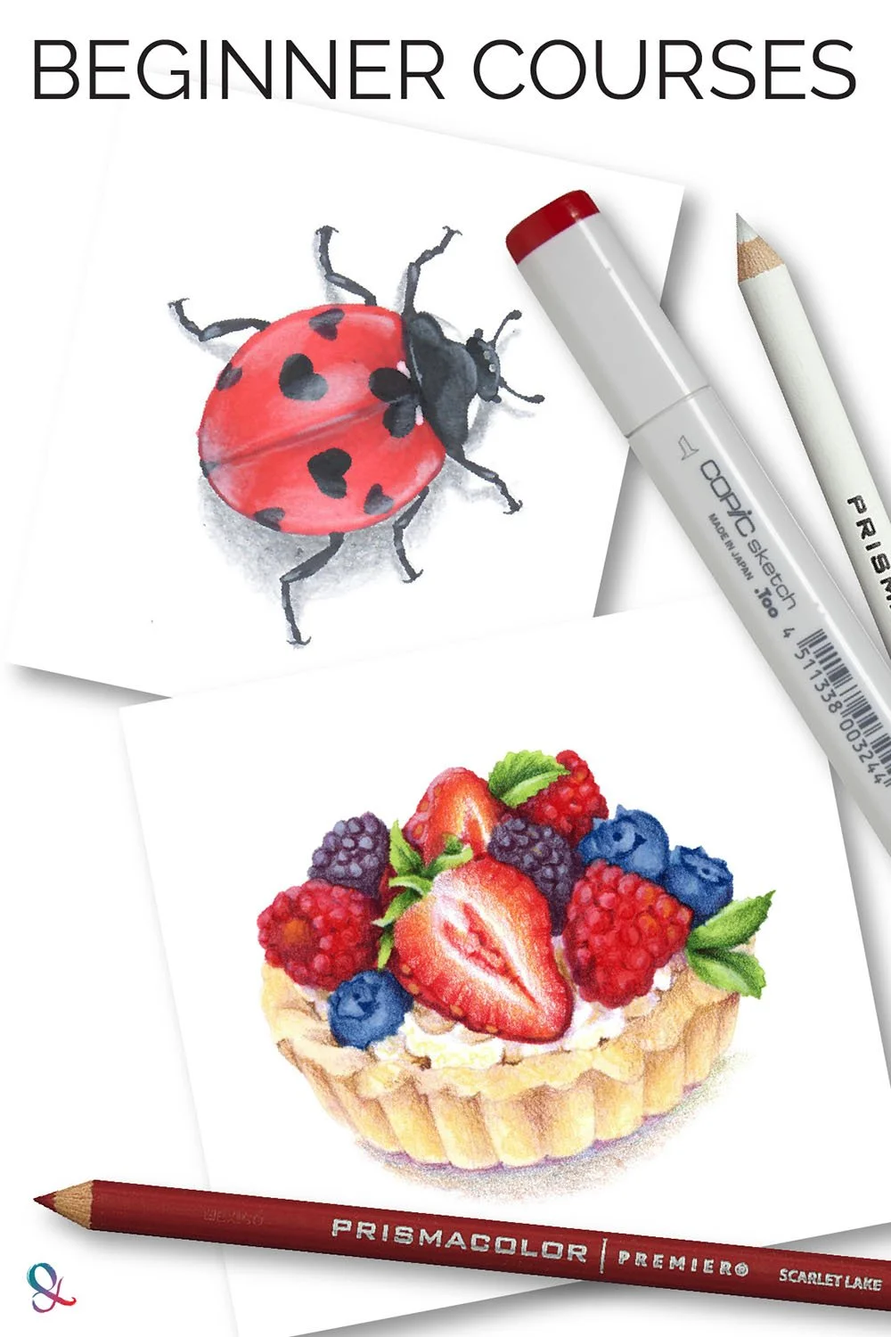
Want to Build a Better Eye for Realistic Coloring?
Color Wonk is where we practice this kind of looking.
The projects are not just about finishing a pretty picture or matching my sample as closely as possible.
We talk about why form matters, why value structures work, why some colors need to be muted, and why the best correction is not always the most obvious one.
You still learn marker and colored pencil techniques.
But the bigger goal is learning to understand what your project needs and why.
That is the kind of skill that makes you less dependent on step-by-step instructions over time.
Because realistic coloring does not improve with techniques or time.
It improves when you learn to see more clearly.
That is what we work on inside Color Wonk.
Ready to Go Deeper?
Realistic coloring gets easier when you stop chasing recipes and start understanding artistic decisions.
If this article sparked a new way of seeing, here are a few places to continue exploring:
Learn Artistic Realism

Guided Workshops
Build Basic Skills
RELATED ARTICLES: